I checked the contents,
but the context may be weird with the translator. Please take that into account.
Hello, I'm Trhisell from Team Rarestone.
I've always thought that artists should speak through their art.
Although the Nikke Hanbok series started unexpectedly,
I became genuinely fond of it and enjoyed drawing it in many ways.
That's why I decided to write this review.
First of all, Team Rarestone is a two-person team.
I, Trisel, am the one who handles the illustrations.
The other member is actually a programmer.
While we both thought it would be great if we could make a game together, it seems unlikely for the time being.
He used to be good at Japanese and helped with translating communications from Japan. However,
with the advancements in artificial intelligence,
text translation is no longer necessary these days.
So now, he has taken on the crucial role of having fun on my behalf (…?)
Our team name, Rarestone, comes from combining parts of our own names,
which results in the meaning "rare stone."
Before I get into my review of the Nikke Hanbok series, there were three key points I focused on while working on it.
- First: Avoid making it look cheap.
I was illustrating our country's traditional clothing, and I thought that if any part of it looked cheap, it could cause various problems. I also believed the perception from people in other countries might not be positive. Honestly, because of this, I tried to avoid drawing the chest or hips as much as possible, which was a bit challenging for me as an artist. But since it was the first series, it felt necessary. However, I think we can be a bit more free in this aspect later on.
- Second: Make it look recognizably like a hanbok.
Even if I couldn't strictly adhere to the exact historical details of hanbok, I made it a priority to illustrate it to a point where people would see it and immediately think, "Ah, that's a hanbok." This part was quite difficult because even a small change could make it feel Japanese or Chinese in style.
While working on it and looking at various references and fan art about hanbok, I came across a post that pondered, "Is it a hanbok just because it has the ribbon ties (goreum)?" When I saw that, I thought, "Yeah, that's true." To me, more than anything else, the goreum is the most distinct feature that clearly sets hanbok apart from Japanese or Chinese clothing.
Another major point I considered a key characteristic of our traditional attire was headgear. A foreign visitor to our country in the past once said that Joseon was "the country of hats," and it's true there was an incredible variety of headwear. This was true not only in the Joseon era but also in previous periods. So, in the Nikke Hanbok series, every character except for the initially drawn Arcana is wearing something on their head. (In Master's case, it's just a headscarf since she has a haenyeo diver concept).
- Third: It had to feel true to the Nikke characters.
This was also an extremely difficult aspect to maintain. Since it's a Nikke Hanbok series, I was putting hanbok on the Nikke characters, but adding something to their heads made the characters who normally don't wear anything feel different. Also, for characters whose original outfits reveal a lot of their physique, overlaying the silhouette of a hanbok created a different feel. It was very, very challenging to maintain their original image while continuing the hanbok series.
Therefore, it was tough but enjoyable to work on the series while adapting it to each character's personality, the color concept of their default outfit, and the image of their clothes.
I worked on the Nikke Hanbok series illustrations by focusing on these three key points.

The Nikke Hanbok series began with Arcana.
To be honest, when I first saw Arcana, the initial ideas that came to mind were the white traditional mourning dress (Sobok) and Vietnam's traditional costume, the Ao Dai.
I particularly felt that the Ao Dai, a white outfit that clearly reveals the body's silhouette, would match well with Arcana's default clothing. But just as I was about to draw it, I thought, "Isn't it strange to draw another country's traditional clothing when I haven't even drawn a Hanbok yet?"
So, I ended up drawing her in a white Sobok instead, and it turned out to be more enjoyable than I expected.
At the time, I actually had no intention of continuing a Nikke Hanbok series. However, starting with Sora, whom I drew right after, the positive response was so encouraging that
I was motivated to create more pieces for the Nikke Hanbok series.
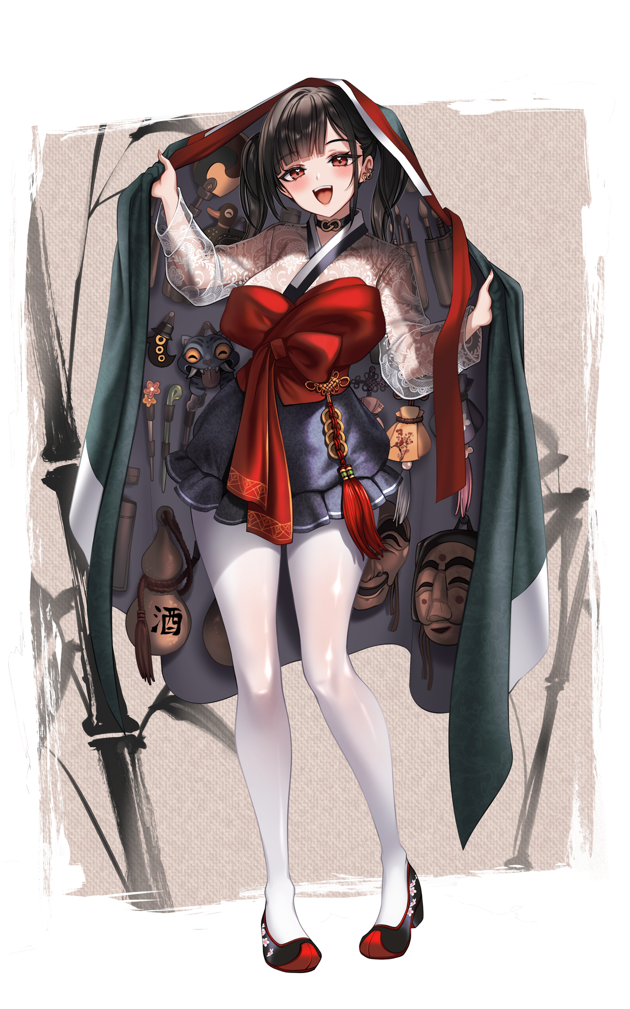
Sora's character design features an open chest area that reveals the inner clothing.
When figuring out how to adapt this concept into hanbok, I thought of using the sseugaechima (a traditional veil).
While researching for reference images, I discovered that what I had known as sseugaechima is actually more accurately called jang-ot. They look quite similar, but the most notable difference seems to be the presence or absence of sleeve-like extensions.
The positive feedback on this piece motivated me to draw another hanbok series illustration,
which ended up being Red Hood.
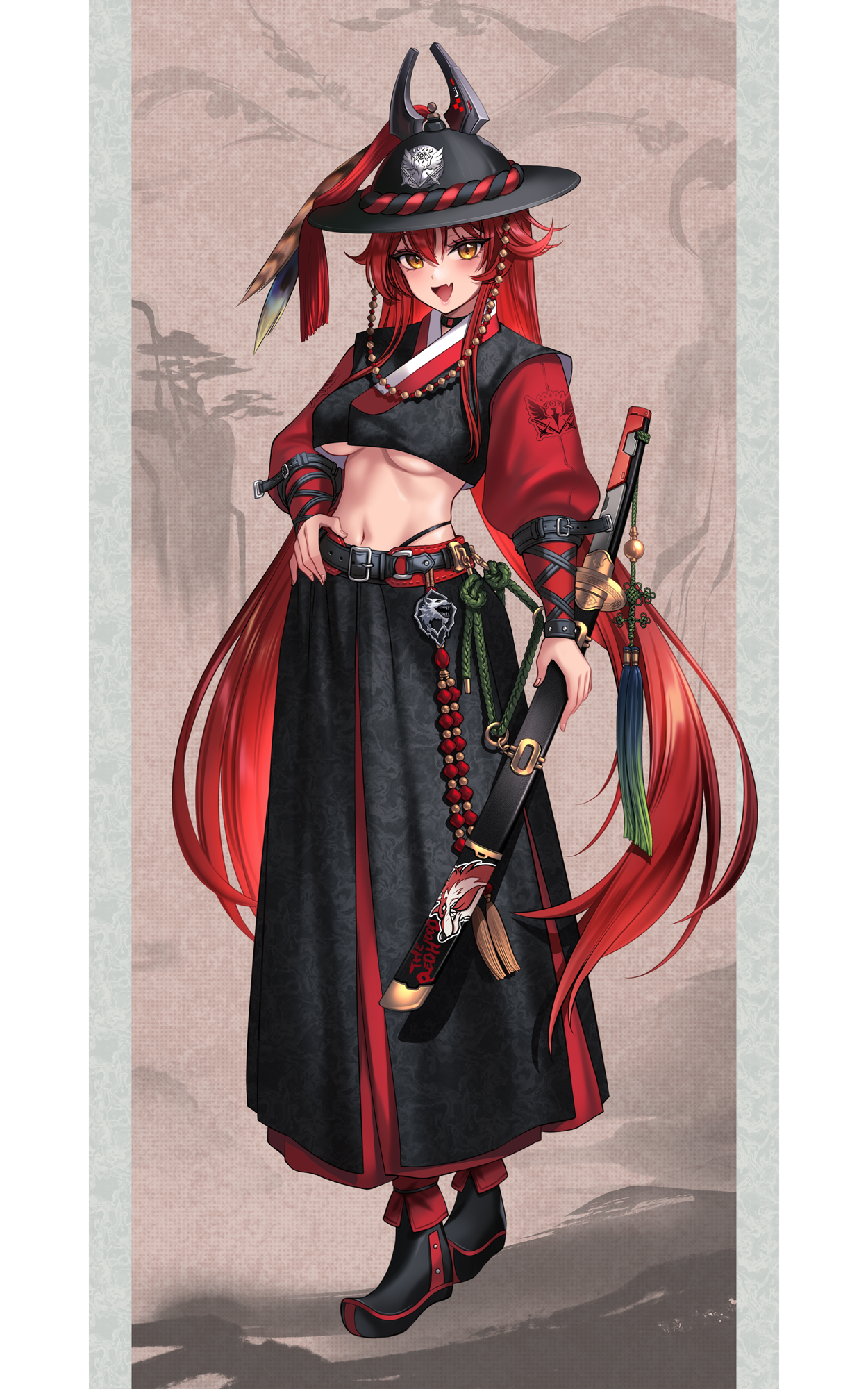
Starting with Red Hood, I began putting more deliberate thought into the hanbok concepts.
To match Red Hood's image, I wanted to convey a bold personality with strong personal convictions, so I decided on a royal guard concept.
While researching, I remembered that the guards in the drama "The Moon Embracing the Sun" wore primarily black and red uniforms. I thought this color scheme would suit Red Hood, so I tried illustrating her in that style.
While drawing the hwando (Korean saber), I had to research references and specifically pay attention to the direction of the blade, as it's typically held differently from other swords.
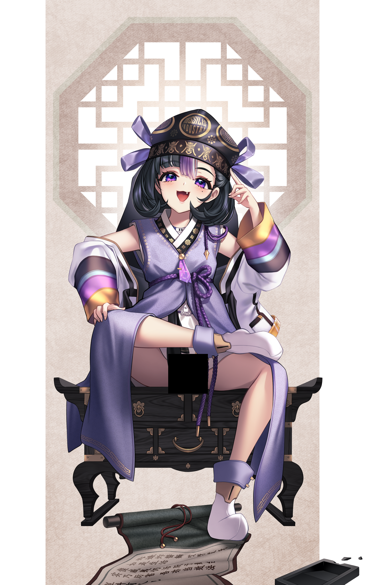
Next, I illustrated Syuen. For this piece, I first decided on the "Doryeongbok" (scholar attire)
and then looked for a character who would suit it.
To be precise, it's a combination of a kwaeja (traditional jacket), a sash, and a bokgeon (headpiece),
but since it's commonly referred to as Doryeongbok, I'll stick with that term.
Since Doryeongbok is traditionally male attire, I was wondering which character would fit it best. The first thing that came to mind was Syuen's signature annoyed expression.
I thought it would be fun to portray him as an arrogant young scholar, so I went with that concept.
It was around this time that I solidified my plan to publish the Nikke Hanbok Series as an fan book.

The next piece I worked on was themed around the "Afterlife Messenger."
While deciding which character to draw for this theme, the original characters I had in mind were Mihara and Yuni.
The reason I chose these two is because of the Samdo River, said to be the boundary between the world of the living and the dead. There's a tale that on the Yudo Bridge, which crosses this river, the memories of the living world are erased one by one over the 49 days of crossing. I thought this theme of death and memory suited these two characters perfectly.
In Mihara's case, her original outfit has a strong SM-style aesthetic that seems quite incompatible with hanbok. I thought that if I could incorporate that essence while still dressing her in hanbok, the iconic black hanbok of the Afterlife Messenger would be a perfect fit. For various reasons, it seemed right.
However, once I actually started working on it, I was plagued with doubts... "Is this really working? Is this the right direction?" These worries just kept piling up, and my progress slowed to a crawl. Even though I was already quite far into the piece, I ultimately decided to scrap it.
The problem was that I had already spent a significant amount of time—about three whole days—on it. This left me worrying, "What piece can I work on quickly to post now?"
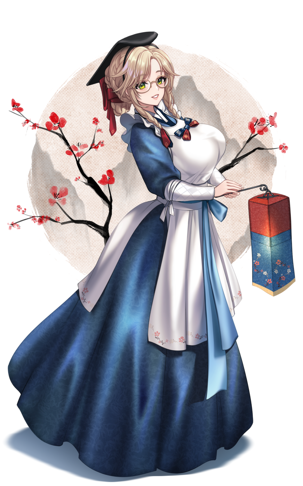
So, I thought that if I used the large skirt silhouette of the hanbok to cover the body, the work might proceed a bit faster. I then wondered, "Which character would suit the hanbok silhouette well?"
While thinking about it, Ade immediately came to mind. Her default outfit has a large, voluminous skirt silhouette, which I thought would harmonize well with the hanbok's shape and also fit the theme of Ade's skills.
This led me to research the attire of female physicians (uinyeo). I ended up using the costume of a uinyeo from the drama "Ma-ui" (마의/馬醫 / The King's Doctor) as a base and illustrated Ade based on that.
Perhaps because I was focused on working quickly, I started when I woke up in the morning and managed to finish the piece by that evening before going to sleep. This allowed me to make up for the time I had lost on the previously abandoned illustration.

Having saved some time with Ade, I decided to invest a bit more in the next piece.
I had been thinking that the hanbok series should probably include at least one military general's uniform. I knew the details would be time-consuming and kept wondering when to tackle it, but I finally decided now was the time.
I started looking for a character who would suit the general's armor. My first thought was Grave, but around that time,
Eunhwa's Tactical Up was released. Seeing it, I thought Eunhwa would also be a great fit.
I tried combining elements of Eunhwa's Tactical Up outfit with traditional general's armor. However, I felt the general's armor was so emphasized that it was hard to immediately recognize it as Eunhwa's character. This lingering concern made me more careful in subsequent works to ensure the character's identity remained strongly emphasized.

While I was researching references for the earlier Doryeongbok (scholar's attire), I remembered coming across many images of children's Saekdong outfits—likely because it was for a child. This time, I decided to use Saekdong attire as the theme and looked for a suitable character.
There are many young female characters in Nikke, but I chose Liter for a couple of reasons. Her grandmotherly way of speaking was a charming factor, but I was also really drawn to the idea of adapting Bolt, the robot dog beside her, to fit the hanbok theme. It seemed like a fun challenge.
I designed the color palette of the Saekdong outfit around yellow as the main color, to match Liter's original costume. For Bolt, instead of a sleek, modern machine, I designed him to look as if he were made from wood, metal scraps, and clockwork.
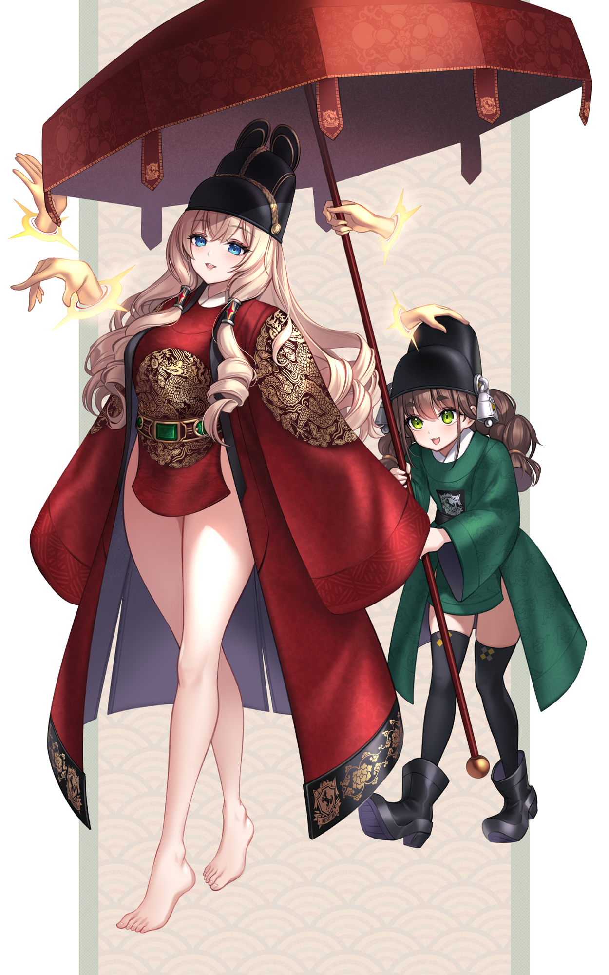
The next piece featured Crown and Chime.
I thought the hanbok series really ought to include the royal dragon robe (gonryongpo), the attire of a king. Since a Korean king would be accompanied by eunuchs, I considered which characters would fit these roles and ultimately chose Crown and Chime.
While Ludmila and Alice give off a somewhat similar vibe, I personally feel Ludmila has a stronger queenly image. Also, since Crown already has a "Naked King" costume, I decided to go with Crown and Chime for this illustration.

I initially wanted to include a police officer ("pojang") holding a three-pronged spear ("dangpa") in the hanbok series. However, the word "po..." in the term suddenly made me think of drawing a cannon ("hwacha" / "hwapo").
And when it comes to cannons and firepower, who else but Neon, our very own "firepower, firepower, firepower maniac," should make an appearance? So, I used the "Cheonjachongtong" (a type of Korean mortar) and "Daejanggunjeon" (large rocket arrows) as key objects in the illustration.

Around this time, I revisited the previously abandoned Mihara and Yuni illustrations.
I started thinking, "Who would better suit the image of the Afterlife Messenger?" and concluded that the four-member Heretic faction in Nikke would be the perfect fit.
Among them, I decided to illustrate Behemoth and Leviathan. I actually wanted to include Ziz as well, but I had established a consistent format for this series: full-body portraits with blank space on either side. Due to a lack of space, I couldn't include her.
Even though this was part of the hanbok series, it was actually my first time drawing a gat (traditional Korean hat). In reality, the crown of the gat isn't as large as the head itself—it's typically smaller and rests on the topknot.
However, if I were to draw the manggeon (headband) underneath as well, it would compromise the character's recognizable image. This meant I had to depict the gat worn low, which inevitably resulted in it being pressed down and the crown appearing larger than usual.
But then again, since I had already planned to transfer the character's horn designs onto the gat, large horns were going to be attached to it anyway. So, the crown of the gat would have ended up larger regardless.

I wanted to include the Bongsan Talchum (a Korean mask dance) in the Nikke hanbok series. While considering which character would suit it, I thought that Neve's large polar bear hood could be transformed into the lion mask used in the dance, and that the silhouettes would match well, so I selected her.
However, although drawing the lion mask was fun, its visual presence became so dominant that I could barely alter Neve's original outfit. I wasn't able to stylize it much, which was a bit of a regret.

Since I had included the Bongsan Talchum mask dance, I also wanted to incorporate Samulnori (Korean percussion music). I considered drawing the janggu (hourglass drum), thinking I might use it for a gisaeng (Korean traditional artist) concept, but I ultimately chose the buk (barrel drum).
I wondered, "Which character would play Samulnori?" and thought Anis would probably join in and play along. So, I ended up illustrating her playing the buk in a Samulnori theme.
Also, considering her role in the story, there's a slight feeling of her being the "neighborhood punching bag"...

I also thought the hanbok series needed a tavern owner (jumo), and the first character that came to mind was Bready, so I ended drawing Crust as well.
I considered putting desserts or bread on the tray she's carrying, but since she's the owner of a tavern, wouldn't it be more fitting to serve up a bowl of gukbap (soup with rice)? So, I placed that on the tray along with a bottle of makgeolli (rice wine).
To be honest, while I had seen the gache (hairpiece/wig) worn on the head in historical dramas, this was my first time drawing one properly. Until now, I had always thought that elaborately braided and styled hair was their real hair.
This led me to worry, "What should I do with the bangs? If there are no bangs, it will be harder to recognize the character..." But then I learned that a gache is actually a wig.
I thought, "Oh? Then it doesn't matter!" and drew her with the gache placed on top, keeping her character's appearance almost completely intact.
I'm happy to say it blended in much more smoothly than I expected, and I think it worked out well.

I thought the gisaeng (Korean traditional artist) concept was also essential for the hanbok series.
Some people might have a rather frivolous image of gisaeng, but in reality, they weren't merely prostitutes. They were cultured artists, well-versed in singing, dance, music, academics, poetry, and painting, and were known for their elegant demeanor.
Therefore, I decided to choose the gisaeng concept from the Prima Donna Squad, who are pop singers. I initially considered Aria because I like her image, but I thought the color scheme of Noise's default outfit would be more interesting to work with, so I went with Noise instead.
Personally, I think among all the Nikke hanbok series illustrations I've drawn, this one has the best arrangement.

There was one simple reason I chose to dress Viper in the hwal-ot (traditional wedding robe).
It can be seen as a kind of wedding dress, and when I thought, "Who would wear a wedding dress?" Viper came to mind because it's as if she'd say, "I'm already wearing one, though?"
Initially, I considered using the hwal-ot's original colors—a scheme involving red, yellow, and blue, much like a saekdong outfit. However, I thought incorporating the rainbow-like holographic effect from Viper's default outfit would look beautiful.
So, I illustrated it by applying Viper's original color palette to the form of the hwal-ot.

Originally, I had planned Part 1 of the Nikke Hanbok Series to be a single 16-page book. With Viper being the 15th page, I intended to use a "Her Majesty, Rapi" concept as the cover for the 16th and final page.
However, it seemed difficult to have the book ready for an October event, and with a lot of time remaining until the December event, I decided to reconsider and expand it to 24 pages.
This meant I needed to draw eight additional illustrations. While wondering who to draw next, I was researching different types of hanbok and the haenyeo (female diver) outfit caught my eye. Since Mast already has a diver skin, I decided to draw Mast in a haenyeo concept.
While researching, I was surprised to learn that before the modern rubber wetsuits became common in the 1970s, the basic attire remained largely unchanged since the Joseon era. The fact that they entered the cold seawater essentially with their bare bodies is incredible and deserving of respect.

I also thought about incorporating the concept of a secret royal inspector ("Amhaeng-eosa").
The thing is, there isn't actually a specific uniform for secret royal inspectors—after all, they had to operate in secret, so having a designated outfit wouldn't make sense.
I was pondering how to capture this image when I thought of Snow White. She roams the surface, capturing Raptures, which seemed to fit the vibe of a secret royal inspector.
Looking at her, I also thought her default outfit could be easily adapted to look hanbok-like. So, I went with Snow White for the secret royal inspector concept.
Although, to be honest, without the royal inspector's badge ("Mapae"), it's hard to tell that's the concept.
While researching, I learned more about the Mapae. It's commonly known that the number of horses depicted on the badge indicated how many horses the inspector could requisition. However, in reality, they rarely requisitioned many horses because requesting more than three would instantly reveal their identity as a secret inspector.
It made me think, "Wow, whether back then or now, the way people live is quite similar."
I mean, when you consider that there are records from even before the Common Era that are similar to now, it seems like the way people live and think doesn't change much. I wonder if it will still be the same even in this age of AI and artificial intelligence.

Some of you reading this review might have wondered: "What happened to the idea of giving the janggu drum to a gisaeng, which was mentioned in the part about Anis playing the buk in Samulnori?"
To be honest, when I was drawing Noise, I considered giving her the janggu. However, I really wanted to depict her holding up the hem of her skirt, so I ended up omitting the drum.
This reminded me that I should draw an instrument. I considered the gayageum or geomungo, but since the Nikke hanbok series illustrations are vertically long, the space seemed awkward for those instruments. So, I chose the haegum instead.
I must admit, I'm a bit embarrassed that I never thought I'd have a reason to draw a haegum in my life. This opportunity led me to look up references and listen to its sound, and I was even more surprised by what a beautiful tone it produces.
I'm at an age where I've surely heard it before, but I think this was the first time I truly listened to it. The sound is so captivating that I still find myself seeking it out occasionally. If you've never heard it before, or if you're curious about what it sounds like, I highly recommend giving it a listen.
So, I had chosen the haegum, but then I had to decide which Nikke character to pair with it. While looking for characters associated with instruments, I found that Julia holds a violin, so I decided to replace it with a haegum.
In her default appearance, Julia plays the violin with her left hand, so I thought she might be left-handed. But in her burst animation, she uses her right hand, which made me think, "???? Is she... ambidextrous?"
For her outfit, I created the design by blending elements from her default costume and other existing costumes. I initially wanted to have a large veil draped behind her, but it didn't look pleasing in terms of silhouette, so I scrapped that idea.

This is Ludmila, a character with a strong queenly image.
The Nikke hanbok series I've been working on has primarily been based on attire from around the Joseon Dynasty era. However, finding a representative "queen" figure from the Joseon Dynasty was difficult.
Well... there is a famously renowned figure from the very late Joseon period........., but I didn't particularly want to illustrate her.
So, I instead took Queen Seondeok of the Silla Dynasty as the concept and drew Ludmila based on that.
While working on it, drawing the ornaments of the Silla gold crown and Silla attire required a tremendous amount of effort, making me wonder several times if there weren't any other queens I could have chosen.
I included peonies in the background. For anyone who might not know the story, I think it would be interesting to look up the anecdote connecting Queen Seondeok and peonies.
---------------------------------
- A sign of wisdom: Some versions emphasize that the story demonstrates Queen Seondeok's profound intelligence, allowing her to deduce the nature of the flowers simply by observing the painting.
- A diplomatic insult: Another interpretation suggests that Emperor Taizong was subtly mocking the unmarried future queen. The fragrant yet barren peony implied that she, too, would be beautiful but without a husband or heir. It is said that Queen Seondeok built Bunhwangsa Temple ("Temple of the Fragrant Empress") in response to this perceived insult.
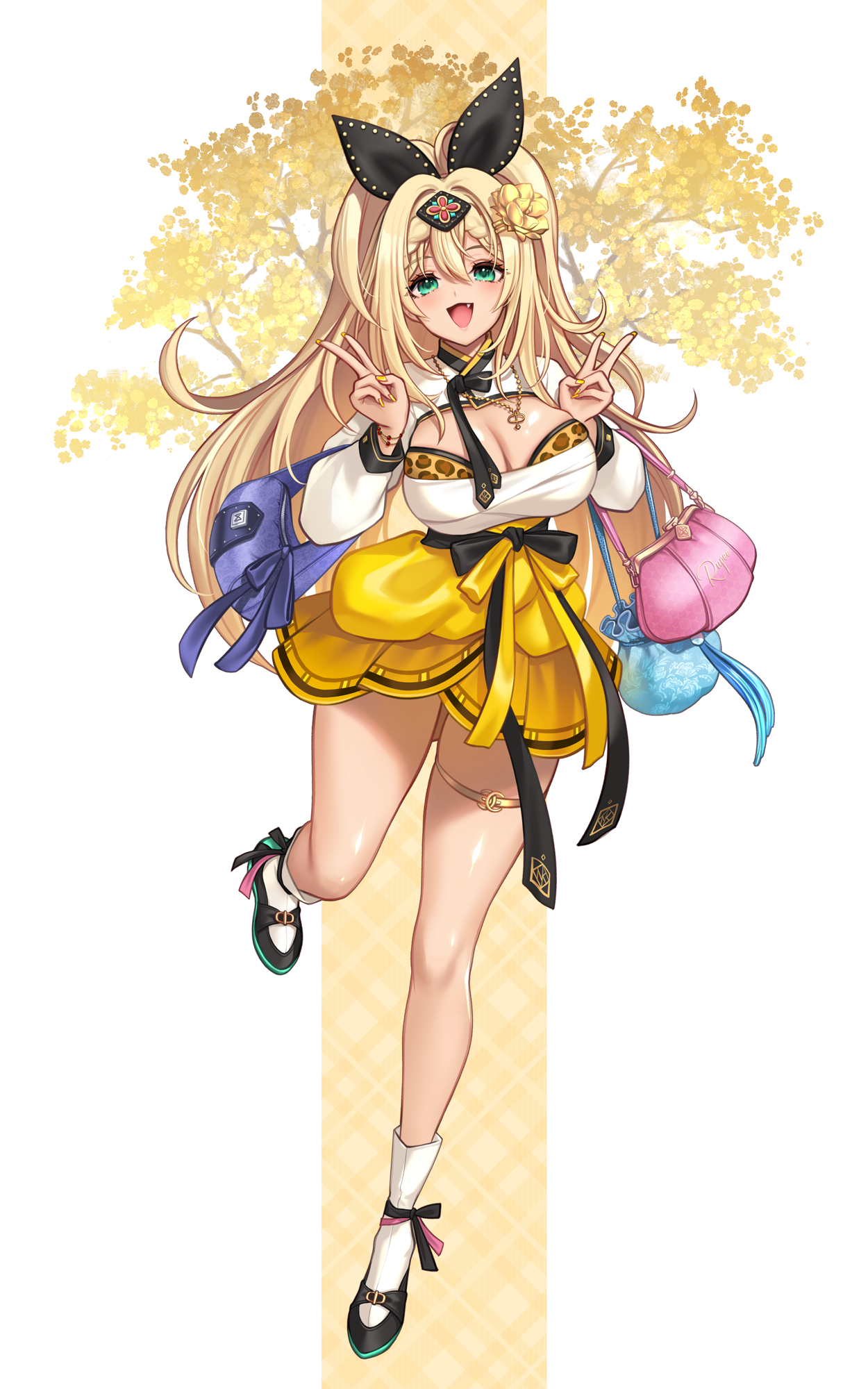
This is Rupee. I originally intended to draw a gal-style hanbok for her, but it ended up just looking like her default outfit with only minor changes to the silhouette.
Every time I see Rupee's default costume, the leopard-print underwear stands out and reminds me of someone I used to know—a girl who always wore at least one leopard-print item in her outfit.
One day, I met her and noticed no leopard print was visible. I even peeked at her socks, but they weren't leopard print either. So I asked, "No leopard print today?" She replied, "I'm wearing it underneath—would you like me to show you?" I remember being completely flustered.
Since then, I can't help but think of her whenever I see leopard print... Well, this story has gone quite off track.
I have a special attachment to Rupee because she was the character I illustrated for a Pixiv NIKKE global illustration contest, where the design won an Excellence Award in the costume design category.
As for the background, I originally considered drawing a Sangpyeong Tongbo coin but ended up with a ginkgo tree instead. I thought the yellow color would suit the composition well.
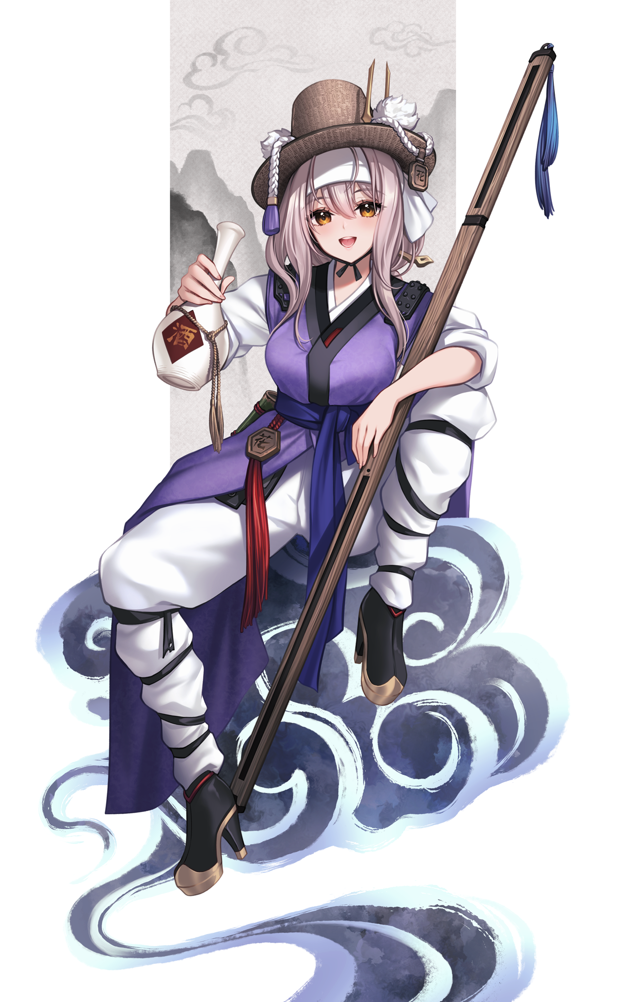
This is Scarlet. When I drew the Queen Seondeok concept earlier, I considered that Silla dynasty attire is also a form of hanbok, so I thought about depicting Scarlet as a hwarang.
However, I had actually been thinking about the folk hero Hong Gildong for Scarlet's concept since the very beginning of the NIKKE hanbok series. So, I tried drawing her with a Hong Gildong concept, but...
Hmm... It ended up feeling less like someone performing Taoist magic and more like a drunken uncle.
I feel so apologetic about it that I think I really must redraw her properly someday.

Since I drew Scarlet, it was only natural that Rose followed.
For Rose, the halo above her head was particularly noticeable. I wondered how to handle it, then thought of using it as a decoration on her hat.
Since it has the Chinese for " 無 " written on it, I tried drawing a shaman's outfit with that concept in mind. The reference shaman outfit I used was similar to a magistrate's robe, and since Rose's default color scheme is black and red, it ended up looking even more like a magistrate's uniform.
I noticed many people in the comments also referred to it as a magistrate's outfit. I think this was a shortcoming on my part.
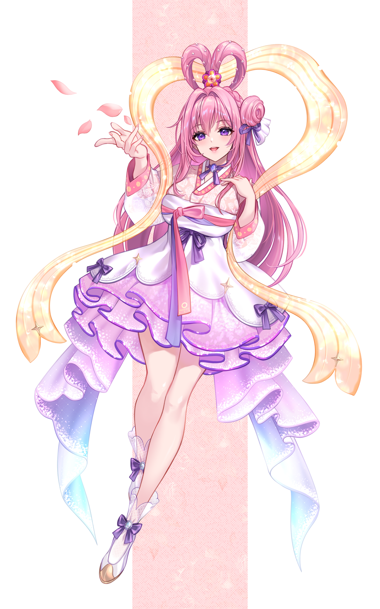
This is Dorothy. I decided on a celestial maiden (Seonnyeo) concept for her and drew her based on that idea.
I adapted her default outfit into a hanbok style, but the part I thought about the most was the "winged robe" (Nalgae-ot). I've often seen that style of winged robe in Japanese or Chinese-inspired imagery, and I wondered if Korean winged robes also had that form.
I searched through various references and remembered that the classic novel The Cloud Dream of the Nine (Guunmong), written by Seopo Kim Man-jung in 1687, also features the Eight Celestial Maidens. This led me to look up illustrations of The Cloud Dream of the Nine.
Upon researching, I found that in very old paintings, there weren't any depictions of them floating in the air like that, but there were garments draped in a somewhat similar manner. Moreover, I noticed that even in North Korean depictions of celestial maidens, such winged robes are used.
So, I thought it wouldn't be too much of an issue, and since this style of winged robe is what people commonly imagine, I went ahead and drew it that way.
Since it's Dorothy, I did consider whether to include Dororong, but in the end, I felt it didn't quite match the image, so I left it out.
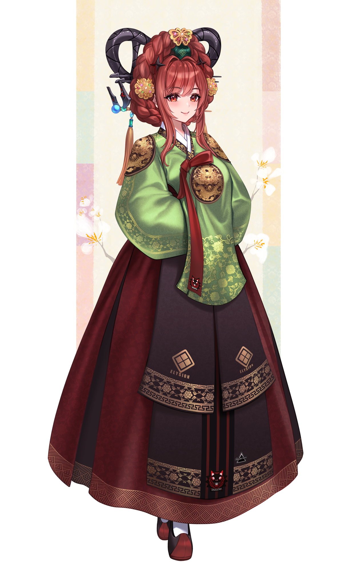
This is Rapi: Red Hood.
Since I initially considered using this as the cover image, I focused more on the hanbok's imagery than on Rapi's own characteristics.
I also learned about the tteoguji hairstyle for the first time. Like the gache, it's an accessory where styled pieces are placed on top of the head. It seems our ancestors placed great importance on having decorations that extended upward from the head, though I'm not sure of the reason.
Looking at the tall gold crowns of Silla, the long feathers worn by hwarang, and many traditional hats like the gat that also have tall elements, perhaps they wanted to appear taller...
Furthermore, the tteoguji hairstyle is typically made to match the black hair common among Koreans. In this illustration, I initially made it reddish to match her hair color, but it felt like it dispersal the viewer's attention, so I changed it to black.
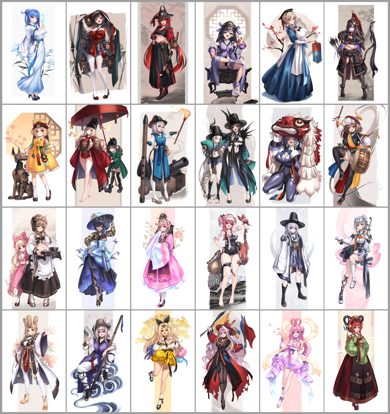
And so, the artwork for a 24-page saddle-stitched book was completed.
Saddle-stitching is a bookbinding method where staples are used to fasten the pages at the center fold. It's a common method often seen in doujinshi and fan books, but due to the binding process, it's generally not recommended for books exceeding 24 pages.
Before sending the book for printing, I plan to make some minor revisions to the previously drawn illustrations. Since it's difficult to make revisions on X, the final versions will be uploaded on Pixiv.
It might be interesting for you to compare them and spot the differences, although most of the changes will probably be so subtle that only the person who drew them would notice.
To be honest, the Nikke Hanbok Series wasn't something I initially planned with a specific intention. However, while working on it, I found it personally enjoyable and also learned many new things.
The positive reception also motivated me to put even more thought into it. Perhaps influenced by the "K-Pop Demon Hunter," I've also noticed that international fans sometimes ask, "What kind of attire is this?"
Feeling the need to provide accurate answers, I diligently revised the English translations several times before responding. It made me feel a bit like I was overstepping, yet somehow acting as a sort of informal diplomat, which made me more cautious.
While working on the Nikke Hanbok Series, I thought it would be a nice approach to publish books in a series like this. After finishing the hanbok series, I considered doing something similar with Japanese or Chinese-inspired styles.
However, while drawing the hanbok series, I found myself approaching our Korean traditional attire with a sense of caution. This made me wonder if freely adapting another country's traditional clothing might be somewhat disrespectful.
This wasn't a thought I'd ever had before, but it occurred to me during the process of creating the hanbok series. I think I need to reflect more on how to proceed.
Furthermore, after seeing the collaboration between Nikke and Kyoto City, I also thought... perhaps there's no strong need for me to tackle a Japanese style myself.
So, for now, I'll consider Part 1 of the Nikke Hanbok Series complete.
I still have some planned illustrations that I haven't drawn yet. If I do create more for the Nikke Hanbok Series in the future, I'll likely approach it a bit differently, both in feel and format, compared to Part 1.
Thank you so much for enjoying the Nikke Hanbok Series I've been working on,
and a sincere thank you to everyone who has even taken the time to read this lengthy review.
An artist's work should speak for itself.
But I think I've spoken for too long. I'll stop here. Thank you.